Team
1 Designer
Role
Product Designer
Duration
Jun. 2024 – Dec. 2024
Tools
Figma, Jitter
CONTEXT
Ever miss out on a great event on Instagram and only find out the next day?
Instagram has quietly become one of the best places to discover things to do — but event posts look just like everything else in the feed, so it's easy to scroll right past the one that mattered. And even if you catch it, actually going means bouncing between a caption, a profile link, a registration site, your calendar, and a group chat just to lock in plans.
That gap led to one question:
What if Instagram had an event ecosystem, instead of just event content?
Before designing anything new, the process started with how people already discover things socially on Instagram. Three channels stood out. Rather than invent a fourth, the design built directly into the three that already existed, borrowing the habits and trust users had already developed.


PATHWAY 1: FOLLOWING
Surface events from the people you already follow
Creators, brands, schools, and local businesses already announce events on Instagram—but these often get buried in the feed. Often, the only sign it's an event at all is a line buried in the caption.
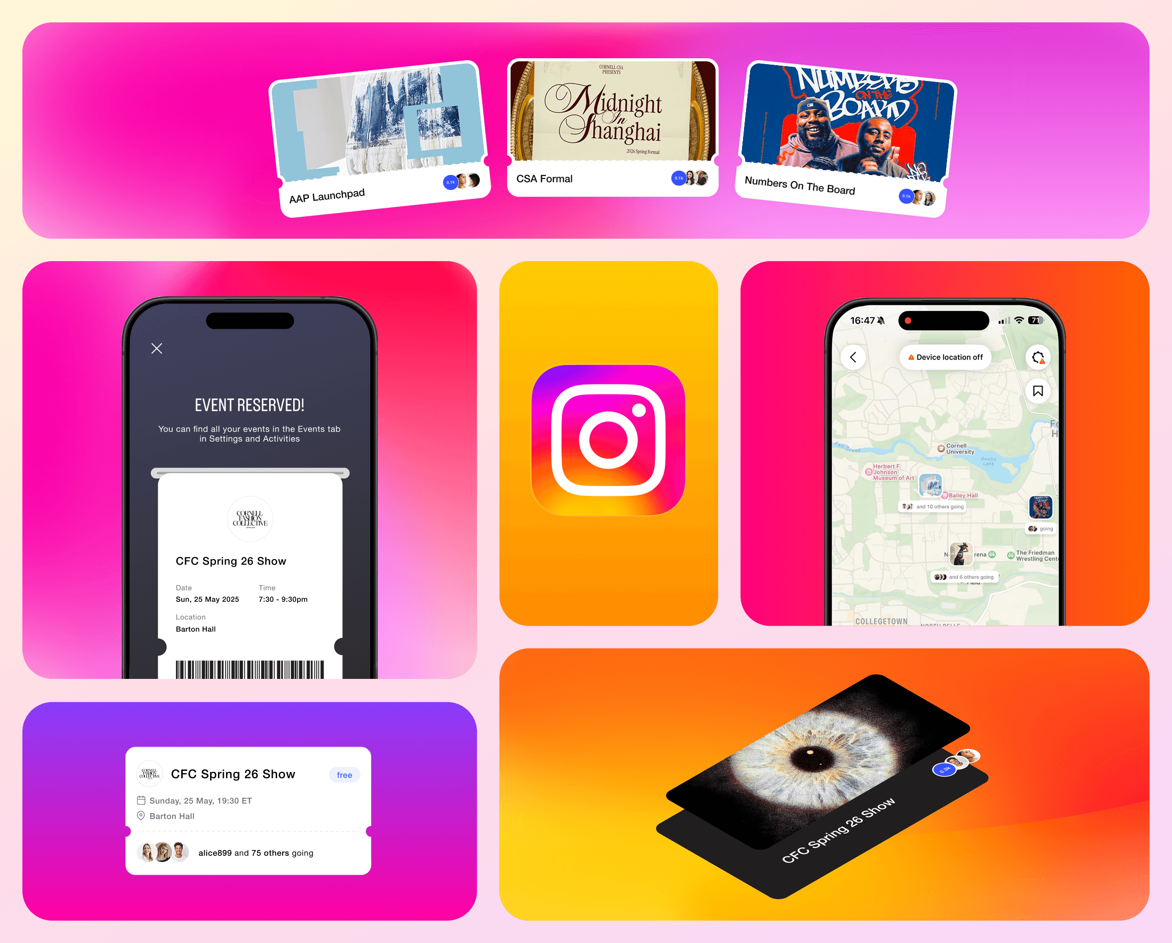
Two lightweight entry points were designed to slot into behavior people already have. Both lead to the same in-app event page, where someone can view details, RSVP, and manage attendance without leaving Instagram.
Entry Point 1: Profile Event Hub
Upcoming events get their own home in a profile's link section — a dedicated place to browse what's coming up, instead of scrolling back through months of posts.
Entry Point 2: Event Post Indicator
Posts tied to an event get a small banner beneath the content, so they're instantly recognizable mid-scroll.
✦
Design highlight: the digital ticket
Most event tickets feel like receipts. The goal here was for them to feel like part of the celebration instead. After reserving a spot, users get a personalized digital ticket styled after the event itself — a small, delightful reward for RSVPing.
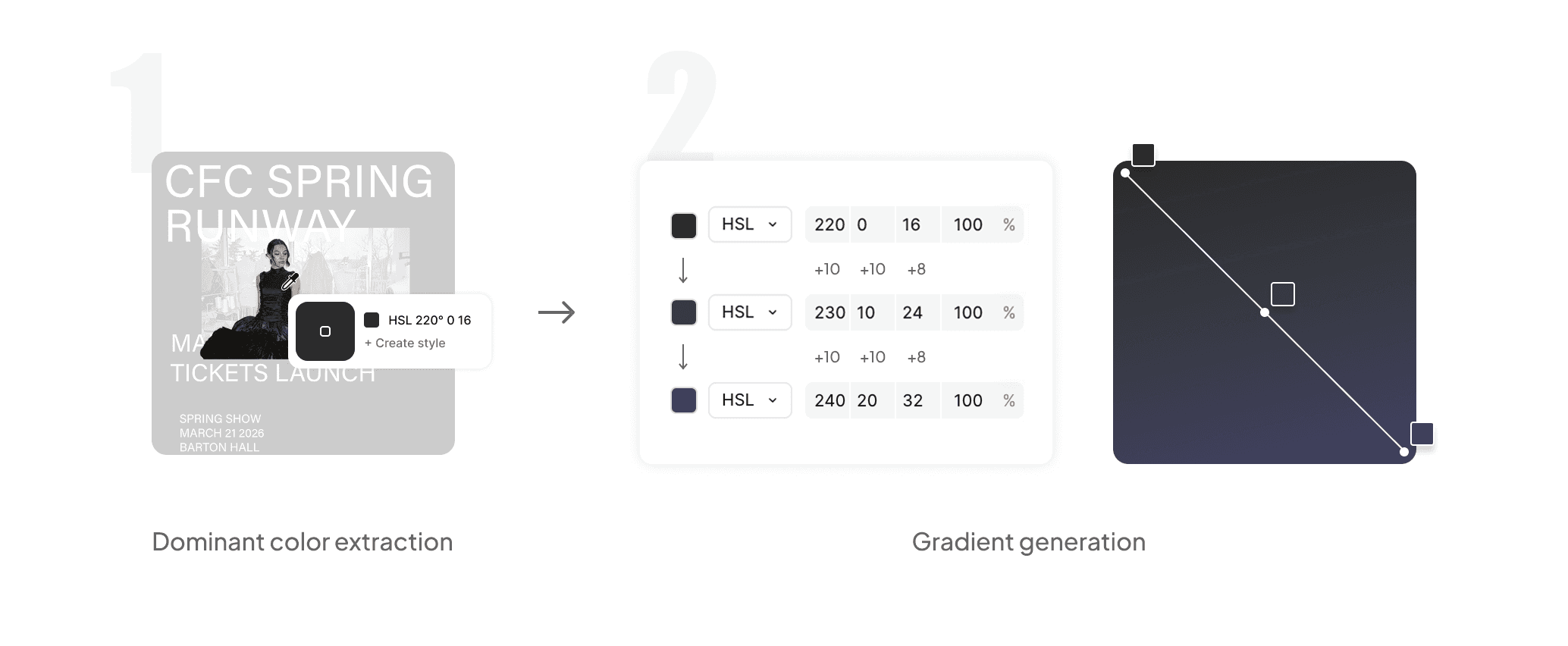
The background is generated automatically from the event's imagery, in 3 steps:
Step 1: visual prominence detection
The system identifies the most visually prominent element in the event image.

Step 2: color extraction & gradient generation
It pulls the dominant color from that element and builds a gradient from it.
Step 3: accessibility & legibility check
The background color sits behind text content and must meet WCAG accessibility standards (4.5:1 for normal text, 3:1 for large text) using either pure white (#FFFFFF) or near-black (#0A1014).
Selection logic :
Test each background color against white and black text
Choose the text color (white or black) that has the higher average contrast across candidates
Reject or adjust any background that fails minimum WCAG thresholds

PATHWAY 2: FRIENDS
Discover events through the Friend Map
Sometimes the best way to find something to do is to see what your friends are already doing. Building on Instagram's Friend Map, events a friend has reserved appear on the map on the day they're happening. This turns event discovery into something a little more social, spontaneous, and fun.
✦
Design highlight: progressive disclosure by zoom
A map full of events sounds exciting... until it becomes a sea of pins.

To prevent visual overload, events dynamically adjust based on zoom level:
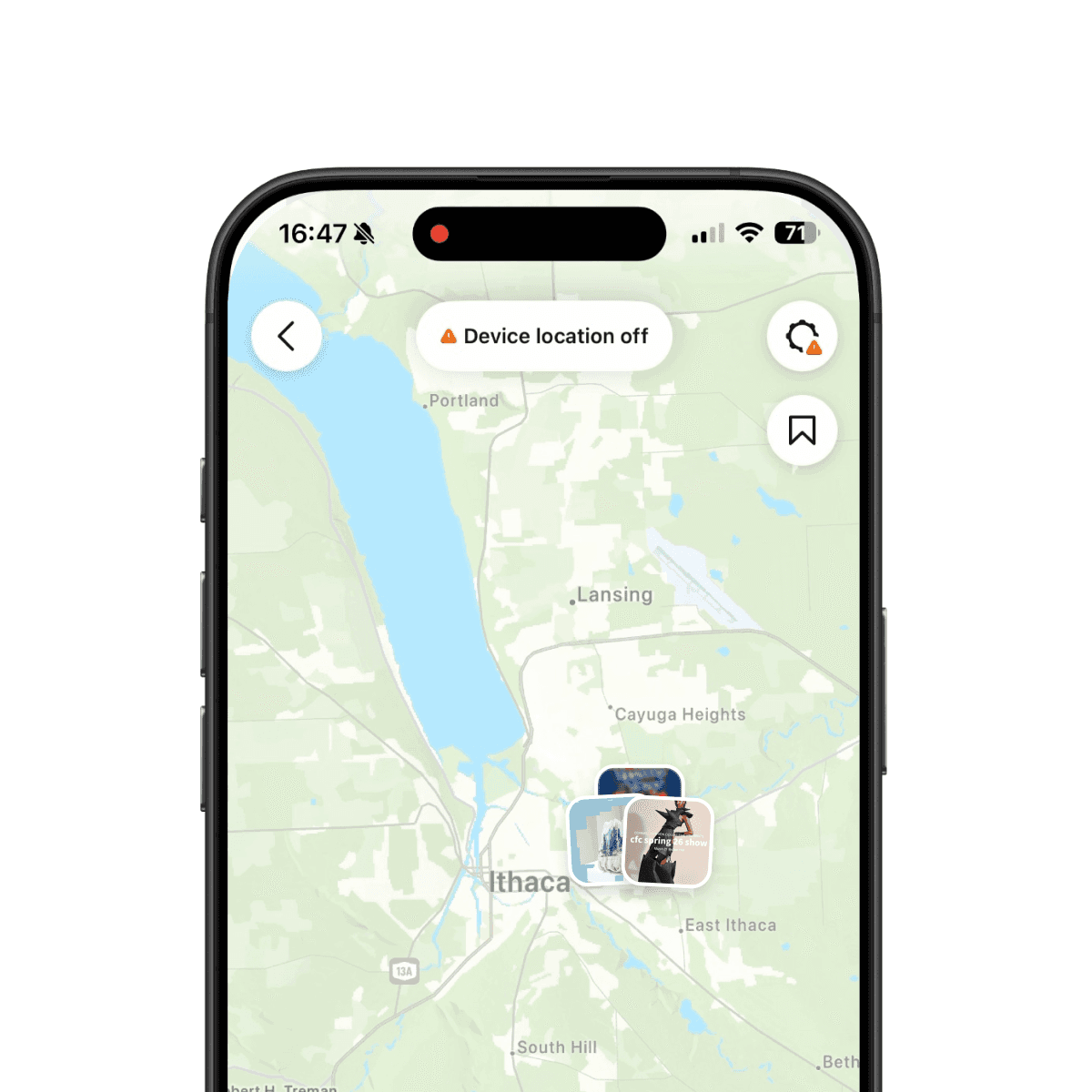
Events in stack
At a high level, events cluster into stacks

Events spread
As users zoom in , stacks gradually separate into individual events

Tap
Tapping an event brings it into focus and reveals a detailed card
PATHWAY 3: DISCOVERY
Discover events beyond your network
Not every great event comes from someone you know. To support serendipitous discovery, personalized event recommendations were explored, woven into posts and stories. These recommendations consider factors such as location, timing, and friends attending—helping surface relevant events naturally while giving organizers more visibility.
Feed
Story
✦
Design highlight: feed — flat, but make it fun
The challenge was making discovery feel lively within Instagram's flat design language. Depth and perspective were explored first, but the effect clashed with the rest of the app. The final direction stayed flat — playfulness came from a slight tilt and a ticket-inspired card instead.
Stacked cards
✓ Playful and immersive
✗ Too perspectival, out of step with Instagram's design system
What if we flatten it to carousel…
✓ Clean and flat
✗ Too quiet, nothing signaled these were reservable events
☺︎ Ticket card - flat but playful
✓ Dashed line and notches read as "ticket"
✓ Slight tilt brings back the playfulness without breaking from Instagram's visual language
✦
Design highlight: story — subtle over ceremonial
Motion carries feeling and the goal was for motion to spark a bit of excitement without overwhelming the experience. Different approaches to animation were explored to find the one that captured that feeling best.
Slow & dramatic animation
✓ Ceremonial, sets a grand tone
✗ Too dramatic, feels off-putting for some
✗ Title and cards move differently, disjointed
☺︎ Subtle animation
✓ Everything fades in together, feels organized
✓ One-directional along the vertical axis, feels clean and cohesive
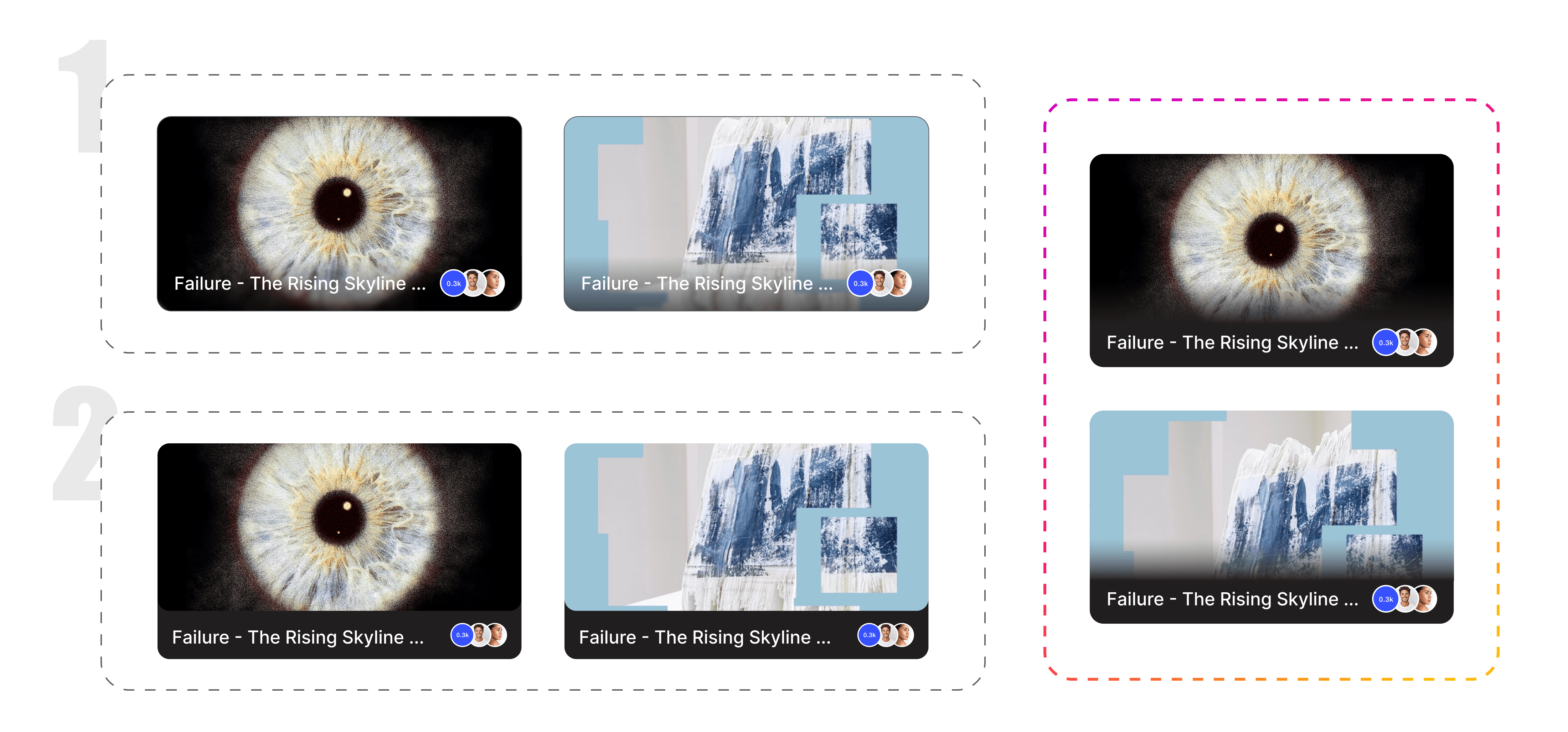
The cards also went through several iterations to find the treatment that held up best across images of different lightness, balancing accessibility with visual appeal.

REFLECTIONS
Impact lives in the system. Delight lives in the details.
Every addition was designed to build on the ecosystem around it, maximizing its impact and real functionality. Small, subtle motion transforms that functionality into moments of delight.
